Programmers Force Website Revamp
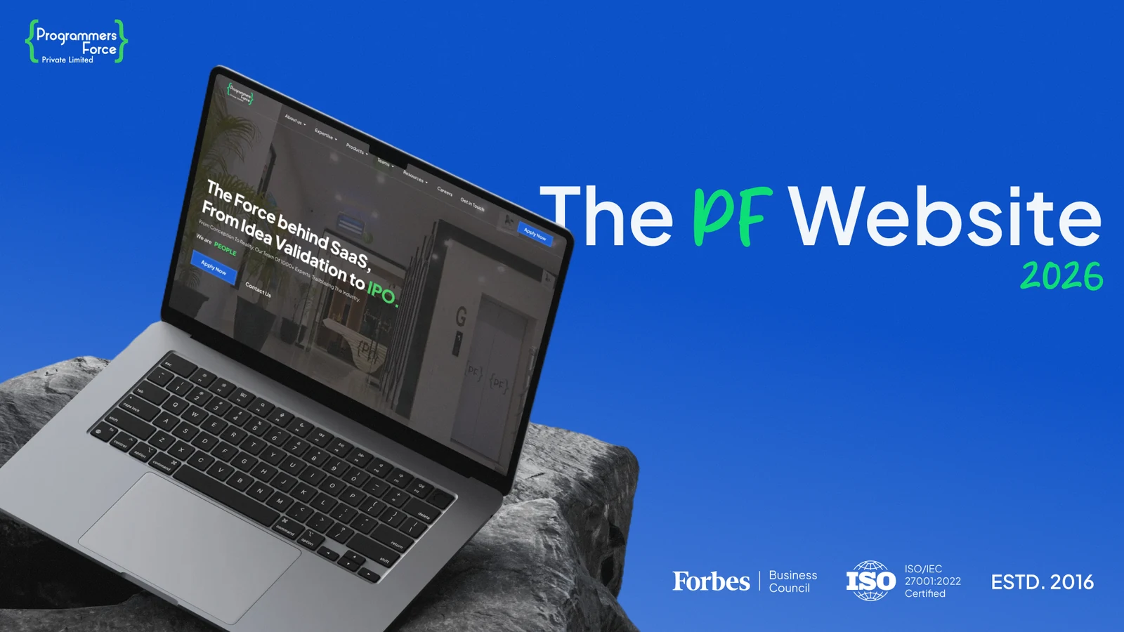
I led the end-to-end revamp of the Programmers Force website - a brand-new sitemap, 42 pages proposed and designed (up from 7), resolved compliance and accessibility gaps, and a refreshed visual system that finally reflects PF's culture and values.
- Role
- Project Lead · Web Designer
- Scope
- Sitemap · IA · UI · Accessibility
- Tools
- Figma
- Type
- Website revamp
- Platform
- Web
- Pages
- 42 (from 7)
- Standards
- WCAG
01 Overview
I led the Programmers Force website revamp end to end. The old site was outdated, missing important information, and carried real compliance and accessibility gaps. I rebuilt it from a brand-new sitemap - proposing and designing 42 pages (the site previously had just 7) - on a fresh visual system that reflects the company's culture and values.
02 Context
Programmers Force is a fast-growing AI and FinTech company, but its website hadn't kept up. With only 7 pages it couldn't tell the full story, key information was missing, and the design felt dated - while compliance and accessibility were falling short of where they needed to be.
03 The problem
- An outdated design that no longer reflected the company.
- Only 7 pages - missing a lot of important information.
- Compliance issues that needed to be resolved.
- Accessibility gaps; WCAG wasn't being followed.
- The brand's culture and values weren't coming through.
04 My role
I led the project end to end.
- Built a brand-new sitemap for the whole site.
- Proposed and designed 42 pages, up from the original 7.
- Resolved the site's compliance issues.
- Fixed accessibility gaps and made sure WCAG was followed properly.
- Defined the typography, color, and visual system.
- Surfaced PF's culture and values across the experience.
05 Process
Audit
Reviewed the old site, its gaps, and compliance/accessibility issues.
Sitemap
Rebuilt the information architecture from scratch.
System
Defined typography, color, and components.
Design
Designed all 42 pages.
Accessibility
Met WCAG and resolved compliance.
06 A glimpse of the redesign
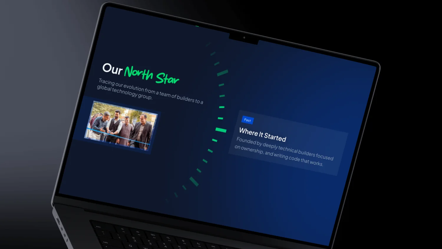
A few sections from the mockups - just a glimpse rather than full screens. Browse the thumbnails or open any full-screen, or see the whole site live ↗.
07 Design decisions
08 Outcomes
A complete, accessible, on-brand website that reflects PF's culture and values - rebuilt from the ground up.
09 Learnings
- Fixing the sitemap first made everything downstream easier to design and scale.
- Accessibility and compliance are far cheaper to build in than to bolt on later.
- A clear visual system let the brand's culture and values come through consistently.