Redesigning an AI product experience to improve usability, engagement & adoption
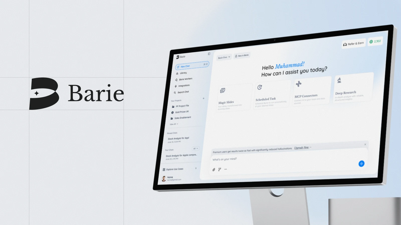
Barie AI is an independent AI product. Its earlier experience suffered from usability issues - users struggled to operate it, causing drop-off and weak engagement. I led a ground-up redesign of the product experience: flows, interactions, and the UI system.
- Role
- Product Designer
- Scope
- Research → IA → Flows → UI
- Tools
- Figma · Prototyping
- Type
- Ground-up rebuild
- Platform
- Web · Mobile
- Team
- Product · Tech · Marketing
- Live
- barie.ai/chat ↗
01 Overview
Barie AI is an independent AI product. I led it from scratch and rebuilt the whole thing. The earlier experience was dull and unengaging, didn't keep users around, wasn't properly usable, and lacked a lot of what the product needed. I owned the rebuild end-to-end - a new design system, a fresh line of features, dark mode, a mobile version, and the B2B side of the product.
Result in one line: a measurably more usable, more engaging product - drop-off down 40% and token usage up 60%.
02 Product context
Barie is a general-purpose, agentic AI product built by Programmers Force. Rather than only generating text, it's designed to do real work - running deep research and executing multi-step tasks across the apps people already use. It pairs a very large context window with live, cited sources to keep answers verifiable, and breaks complex requests into parallel subtasks to return evidence-backed results.
The product spans a broad feature set - deep research and live web search, app connectors for multi-app workflows, image, video and slide generation, a coding agent, reusable skills, and task scheduling - delivered across web and desktop (Windows and macOS), with an on-prem deployment option for enterprise clients. In independent GAIA benchmark testing in early 2026, Barie posted top-tier results across all levels, including the hardest (Level 3). Its users range from researchers and analysts to founders, marketers, developers, and small-business owners.
03 The problem
The earlier design held the product back. It looked dull, didn't engage users, and gave them little reason to stay - on top of real usability gaps and missing functionality.
- The experience felt dull and unengaging.
- It didn't keep users around - weak retention and drop-off.
- It wasn't properly usable; core actions were harder than they should be.
- It lacked a lot of the features and polish the product needed.
- No dark mode and no proper mobile experience.
Why rebuild: incremental tweaks couldn't fix structural problems. The cost of the status quo - lost users, low engagement - justified rebuilding from first principles.
04 My role & responsibilities
I led the product design end-to-end and rebuilt it from scratch - owning the structure, flows, interactions, and the full UI system.
- Built the product's design system from the ground up - defining its typography, color, and components.
- Led a whole new line of features from a design perspective.
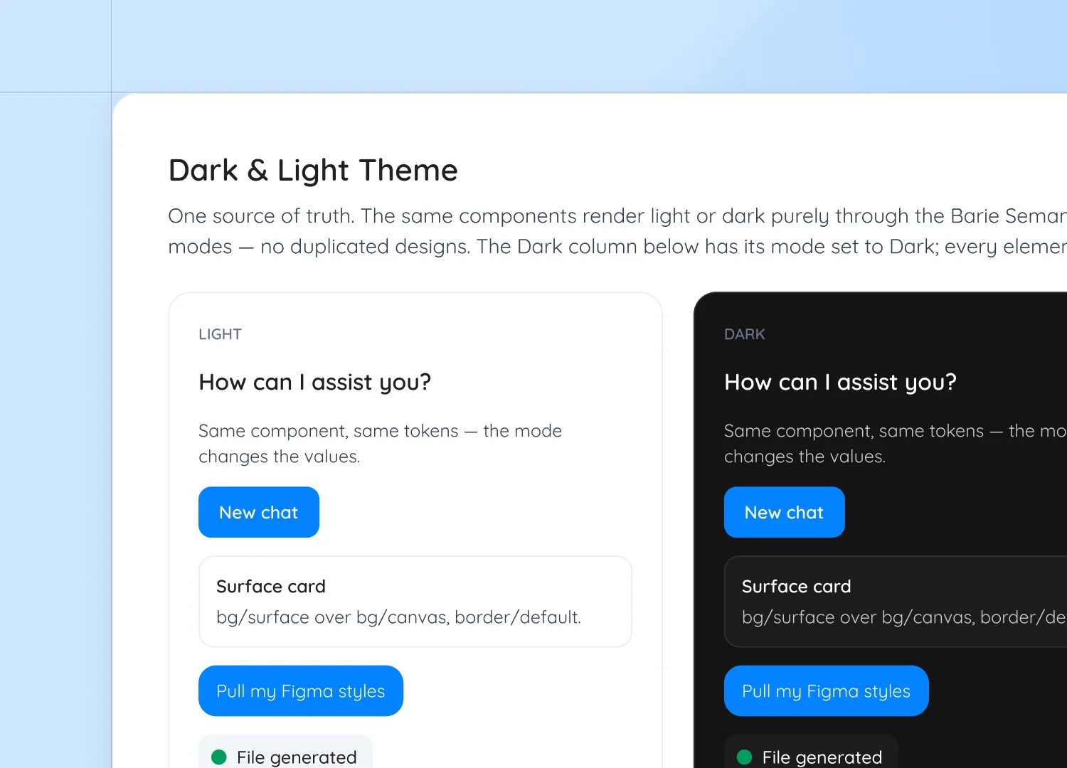
- Designed and introduced dark mode, which the product didn't have before.
- Designed the mobile version of the product.
- Led the B2B side - the design for on-prem deployment solutions offered to clients.
I worked closely with Tech, Product, and Marketing - proposing many new feature ideas and helping Marketing shape creative campaigns and storylines.
05 Design process
I worked from the structure outward - fixing how the product was organized before refining screens.
Audit
Mapped the experience, located friction.
IA
Restructured so core actions were findable.
Flows
Redesigned key journeys end-to-end.
UI system
Consistent components & states.
Validate
Tested & refined against signals.
06 Desktop app
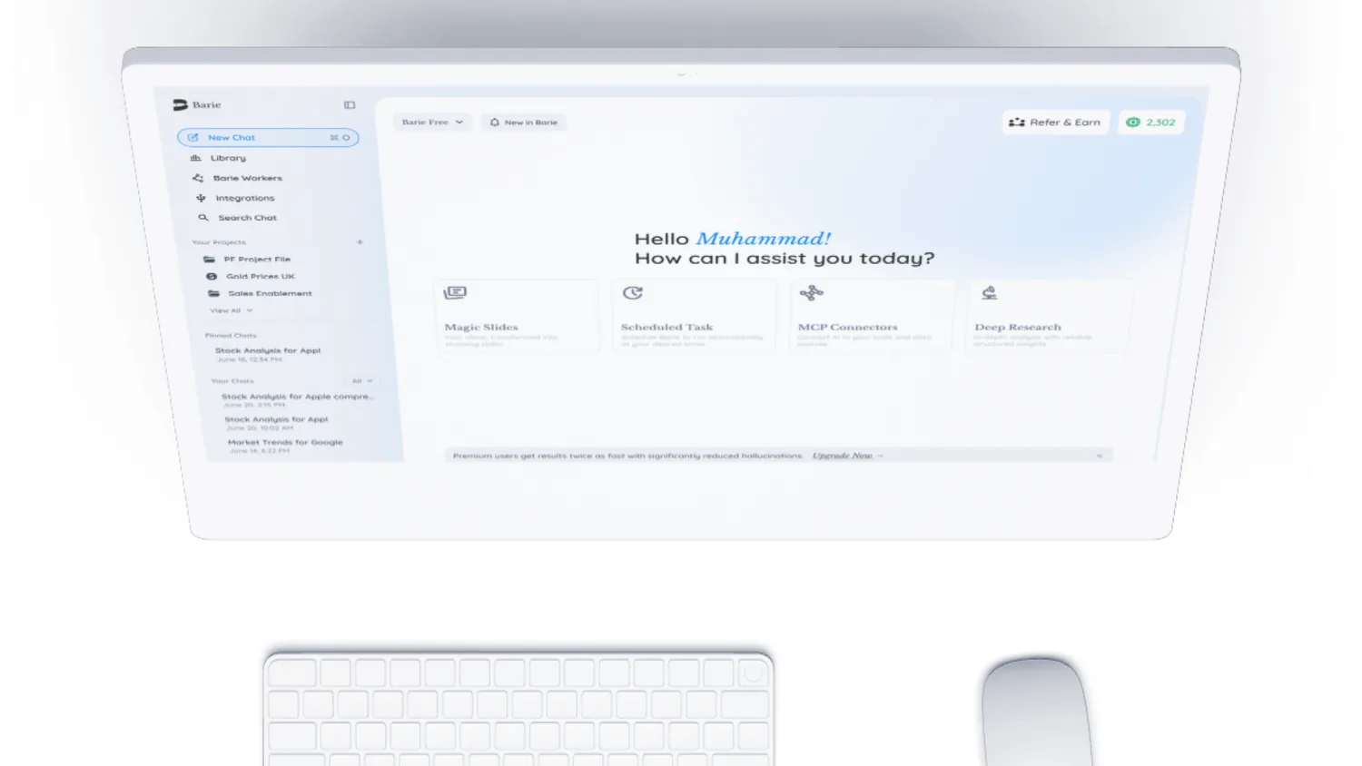
The rebuilt desktop experience across its core surfaces - chat, deep research, documents, library, onboarding, and processing. Toggle light and dark, browse the thumbnails, or open any screen full-screen.
07 Mobile app
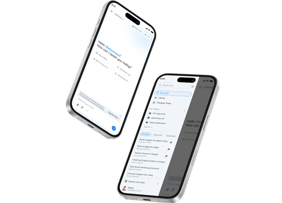
The product never had a real mobile experience. I designed one on the same system - carrying the core flows into a focused, on-the-go companion.
08 UX decisions
A few decisions that moved the needle (problem → decision → result):
09 Design system, UI & interactions
I rebuilt the interface on a design system I created from scratch - defining the typography, color, and components, then adding dark mode and a full mobile experience the product never had.
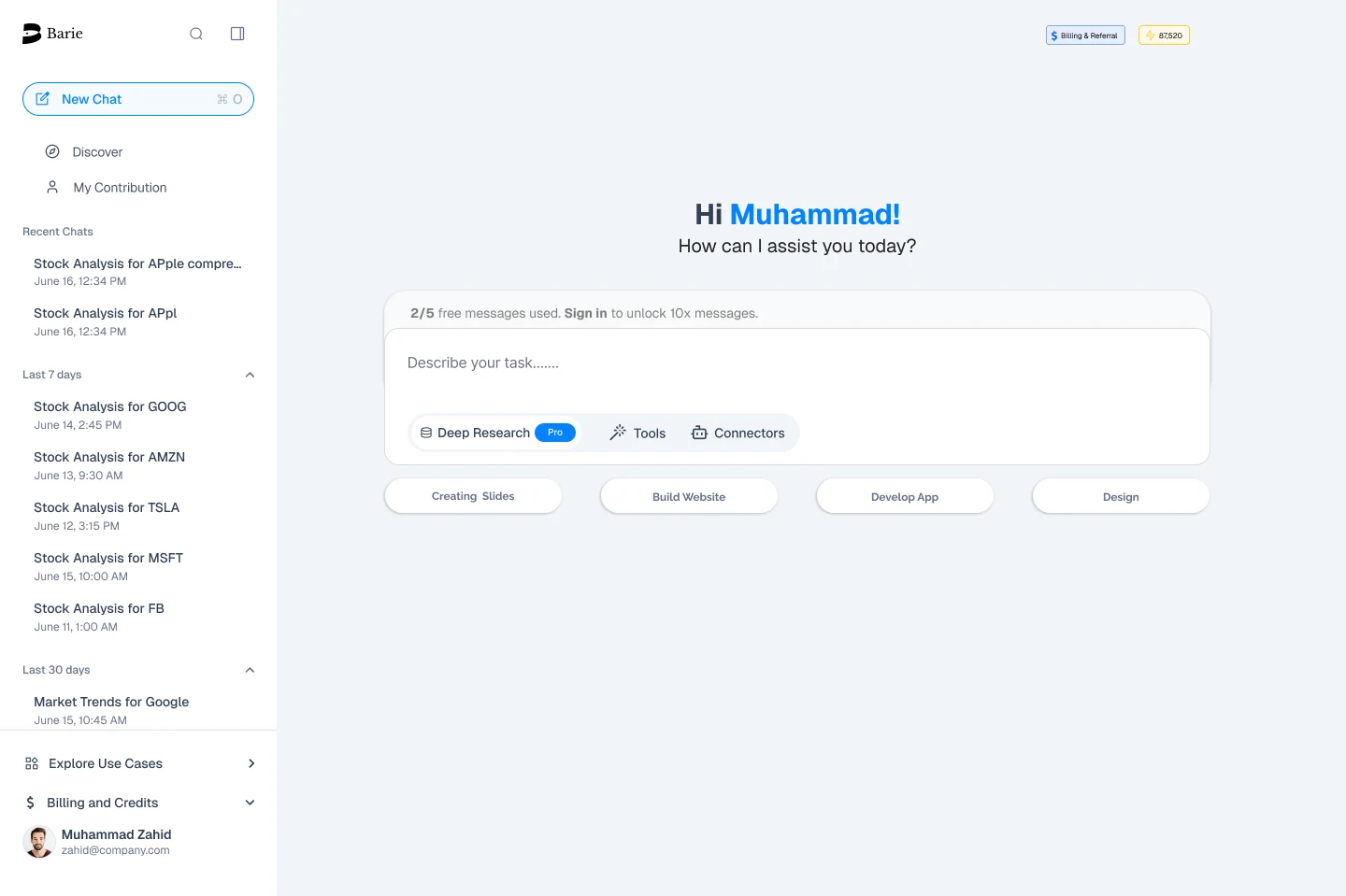
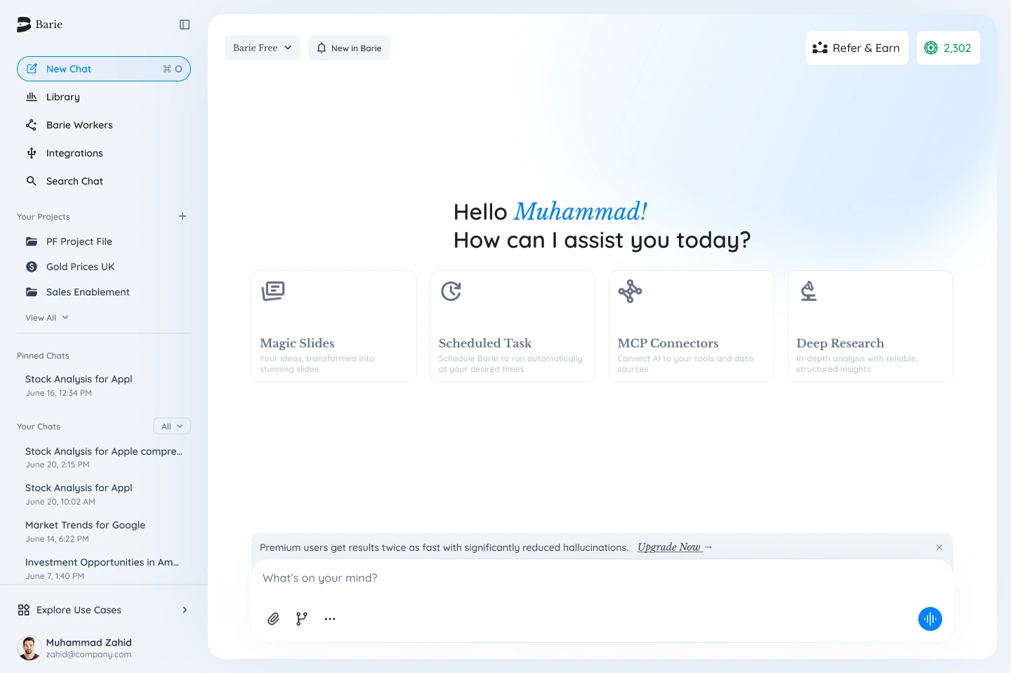
10 Before & after
Drag the handle to compare the old experience with the redesign.
11 Metrics & impact
The rebuild moved the numbers that mattered.
12 Key learnings
- Building a real design system first made dark mode, mobile, and a new feature line possible to ship consistently.
- Engagement followed usability - once the product felt clearer and less dull, people stayed and used it more.
- Designing across web, mobile, and B2B at once meant the system had to scale from day one.